Weekly Correlation Charts: S&P 500 Index (SP)
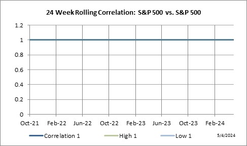
It’s all about the charts … and we have a lot of them. Our correlation charts provide a historic rolling perspective on the relationship between the S&P 500 Index and 40 other markets. The sample chart shown below (Tab 1), illustrates the 24 week rolling correlation, represented as the dark blue line, clearly shows a continually changing relationship between the markets. Sometimes the relationship is strong while at other times it’s weak. The point is … markets move … as such so do their correlations. Thus we need to continually adjust our interpretation as to what is considered to be a high or low correlation level. To assist in this dynamic interpretation, each chart has outer bands of light blue lines (top & bottom) to reflect true high/low correlation levels. Current levels are also posted at the bottom of the chart.
For current correlation charts for the S&P 500 Index … scroll down to the individual sectors covering a total of forty global futures markets.
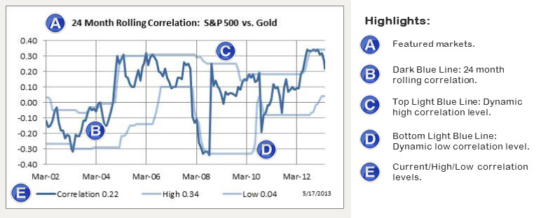
Here are a few basics on how to interpret our correlation charts.
• Each correlation study is based on the market’s % weekly return figure and not price.
• The dark blue line plots the 24 week rolling correlation going back 3 years.
• The lighter blue lines plot dynamic high/low correlation levels that adjust to current market conditions.
• A correlation of +1 signifies a direct relationship while a correlation of -1 signifies an inverse relationship.
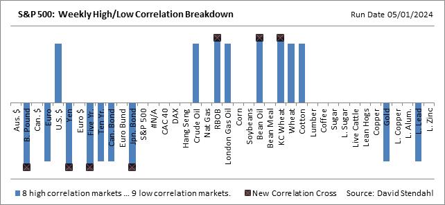
Current Weekly Correlation Breakdown
With a long list of markets to scroll through this section offers a quick visual of markets that are currently in a high or low correlation stage with the featured market.
Note markets that recently moved into a high or low correlation stage are highlighted at the end of the bar with an “x”.
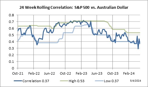
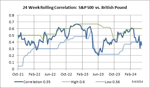
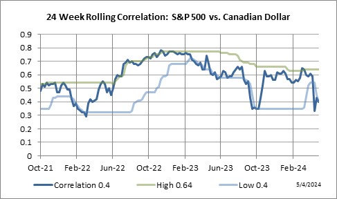
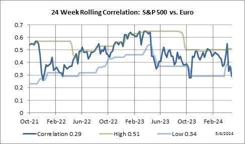
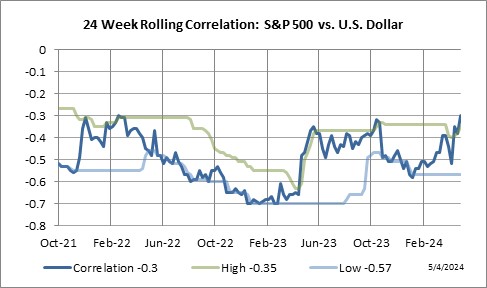
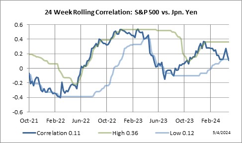
Currency Sector
24 Week Rolling Correlation: S&P 500 Index vs. Currency markets.
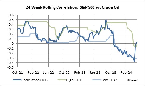
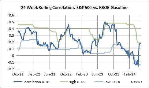
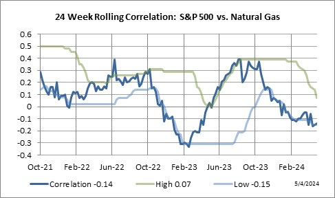
Energy Sector
24 Week Rolling Correlation: S&P 500 Index vs. Energy markets.

Equity Sector
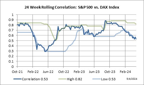
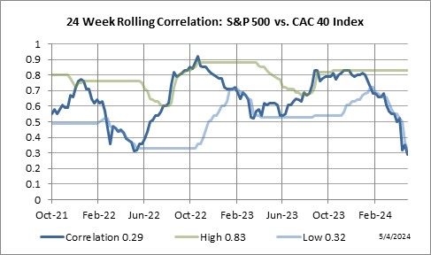
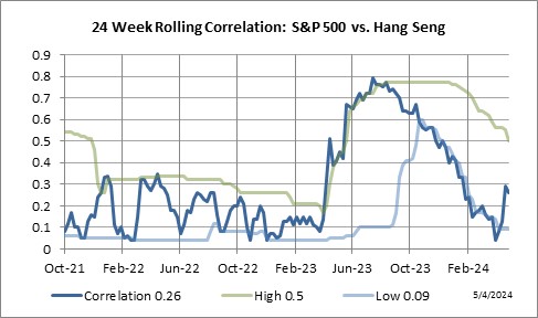
24 Week Rolling Correlation: S&P 500 Index vs. Equity markets.
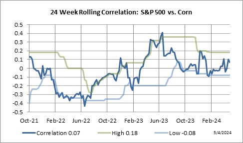
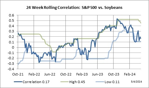
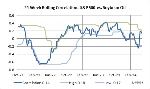
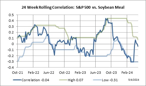
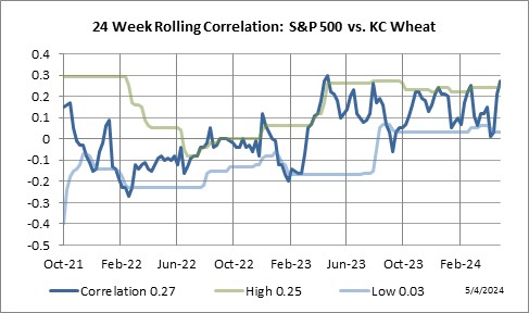
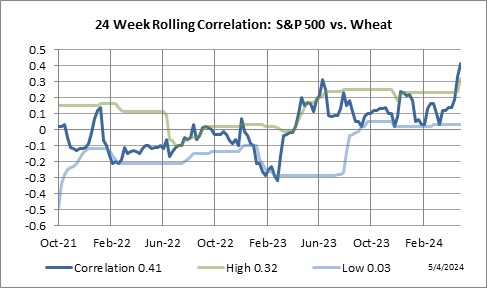
Grain Sector
24 Week Rolling Correlation: S&P 500 Index vs. Grain markets.
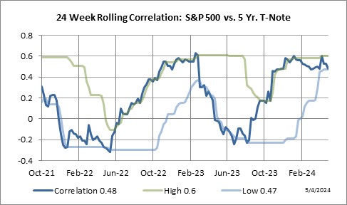
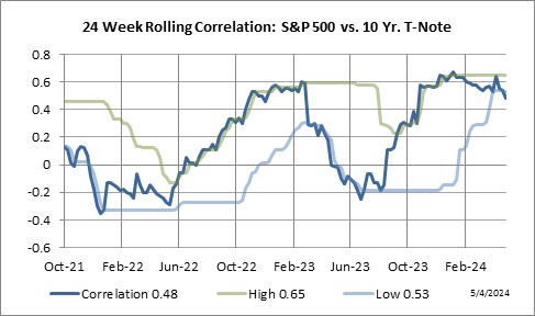
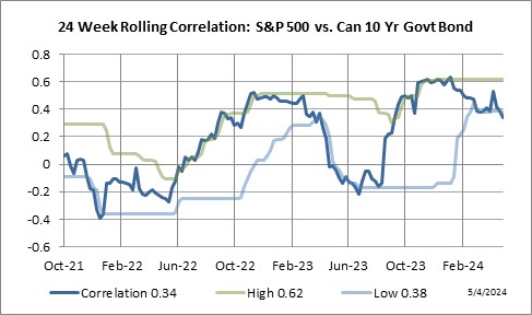
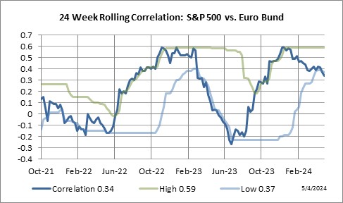
Interest Rate Sector
24 Week Rolling Correlation: S&P 500 Index vs. Interest Rate markets.

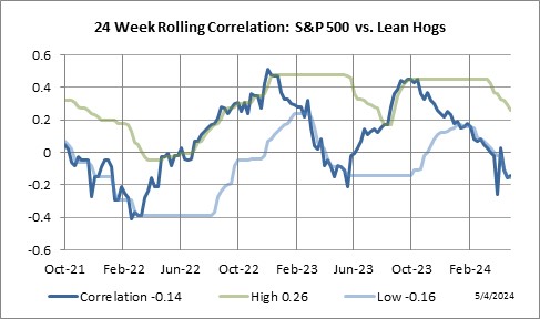
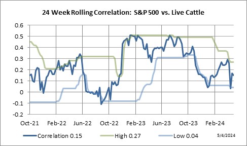
Meat Sector
24 Week Rolling Correlation: S&P 500 Index vs. Meat markets.
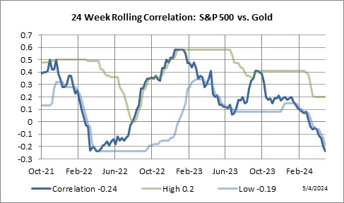
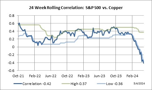
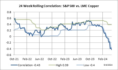
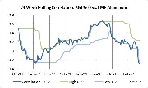
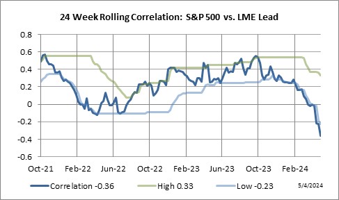
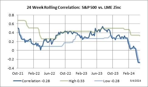
Metal Sector
24 Week Rolling Correlation: S&P 500 Index vs. Metal markets.
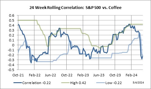
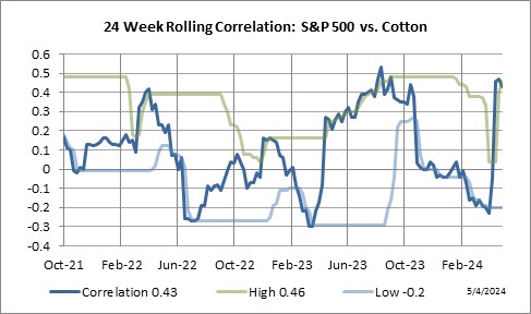
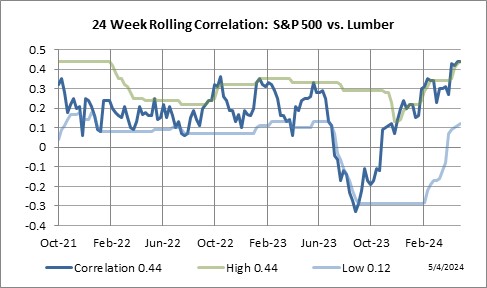
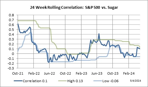
Soft Sector
24 Week Rolling Correlation: S&P 500 Index vs. Soft markets.