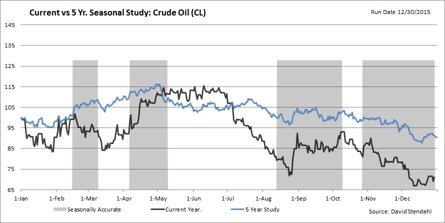
Our Seasonal Accuracy charts compare the current years performance against our 5/10/15/20 year charts. When the current years performance closely matches any of our seasonal charts a grey box is drawn to highlight periods of high correlation. That way we have a better idea when we may want to follow seasonal turning points (see Chart 1 below). This normal chart format uses data only from the current calendar year.
Chart 1: Normal Seasonal Accuracy chart
Unfortunately when January rolls around our Seasonal Accuracy charts take on a new look. To maintain our running accuracy formulas, we have to use data from last year and combine it with data from the current year. To do this we change our calendar start period to begin in March. Notice the bold dashed yellow line in March (see Chart 2 below). Everything to the right of the yellow separator related to the previous year. Everything to the left of the yellow separator relates to the current year. Organizing the data in this format allows us to maintain our Seasonal Accuracy charts until we have enough data in the current year. In mid February, when we have enough current year data, we will switch the charts back to the normal format.
Chart 2: Adjusted Seasonal Accuracy chart
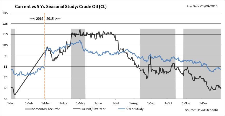
The one temporary inconvenience with the adjusted charts is the connector between the end of the current year and the yellow separator. The black line appear to be calling for a VERY strong bull move in Crude Oil. Remember the black line at the start of the chart reflects the current years performance. Any data between the end of the current date (shown as January 9th) and yellow separator has NOT take place. This straight line connector should not appear on the chart, it’s simple a by-product of drawing a line chart in Excel. So disregard that data until we revert back to our normal Seasonal Accuracy charts in mid February.