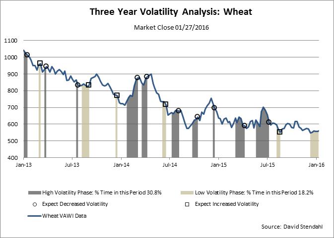
Wheat (W) has been very quiet for a number months. Once this consolidation phase ends we could see a big move with increased volatility.
There are many ways to define volatility. For this analysis we are using an eight week standard deviation of percent return data and then calculation extreme upper/lower levels based on dynamic zones. Periods of high volatility are shown as grey vertical bands while low volatility phases are shown as tan vertical bands. At the conclusion of either phase a circle or square will appear signifying the end of the volatility period. Specifically, circles suggest a decrease in volatility while squares suggest an increase in volatility in the coming weeks or months.
Chart 1: Wheat Volatility

It’s to early to know which way Wheat will break, but as of this writing the odds favor to the upside. We will know more when the current low volatility phase (tan shaded area) ends. Our systems, of course, always have the last word. Wheat (W) signals.


