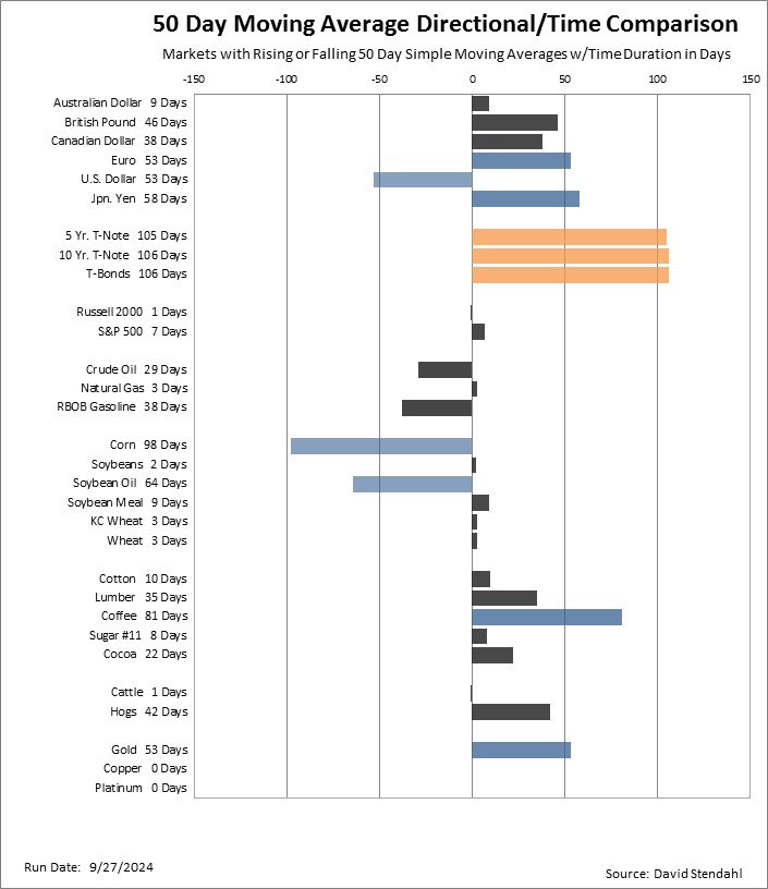
50 Day Moving Average Duration Comparison
The 50 day moving average is a proxy for the intermediate trend of a market. It does an adequate job of keeping you on the correct side of the market. As such, the chart below provides an overview of each market in reference to their 50 day simple moving average (SMA). Markets that have rising 50 day moving averages (i.e. bullish) appear pointed right, while those that have falling 50 day moving averages (i.e. bearish) appear pointed left. The scale of the chart refers to the number of days in which the 50 day moving average has been rising or falling. This simple moving average comparison is not to be used for buy or sell signals but rather as a general overview of current trend duration.
Chart Overview:
- Gray: <= 50 day duration.
- Blue: > 50 but < 100 day duration.
- Orange: >= 100 day duration.
50 Day Moving Average Market Duration Comparison: