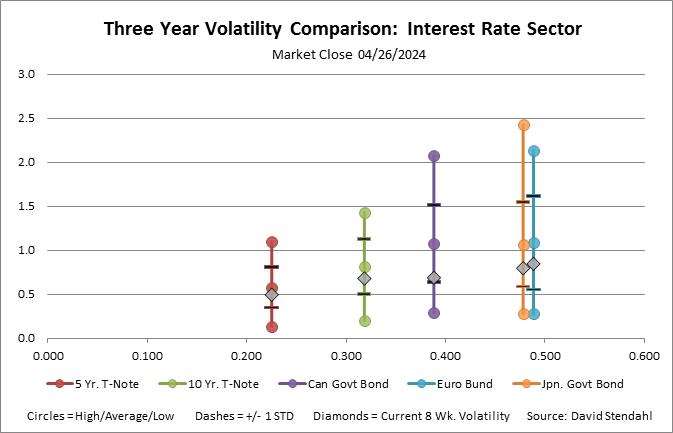
Rolling Eight Week Volatility Comparison: Interest Rates
This rolling volatility analysis provides a historic perspective of various high, low and average volatility levels for each market in the Interest Rate sector. Volatility is a measure of risk. Yet by itself it only measures variance over a single time period. Our rolling three year analysis takes 160 volatility snap shots with each data point calculated using 8 weeks of Standard Deviation Percent Return performance. With this rolling data, market volatility can be viewed within a single vertical profile line. More importantly the data for a single market can be easily compared with other markets in the Currency sector. The vertical profile line provides insight into volatility greater than any single point.
The vertical lines profile, shown below, is divided into five main sections.
- Extreme volatility, represented by the high and low circles, shows the maximum and minimum 8 week volatility level over the test period.
- Superior volatility, represented by black bold lines, shows historic volatility levels that are +/- 1 Standard Deviation away from the average.
- Average volatility, represented by the circle within the vertical line, provides perspective on the norm.
- Current 8 week volatility, represented by the grey diamond, shows recent volatility relative to the past three years.
- Horizontal placement, represented by historic volatility, which is defined as the spread between average high and average low volatility over three years. The further to the right the markets vertical profile line is on the X axis the more extreme the historic volatility.
Rolling Three Year Volatility Comparison: Interest Rates

Click to enlarge
