Seasonal Charts Introduction
Seasonal charts should be used as an historic reference of past trends and turning points and not as a buy/sell recommendation. We provide three different seasonal charts: traditional, accurate and projection. Traditional charts point out historic high low turning points, seasonally accurate charts compare the current year to historic time frames to determine if they are closely tracking past trends and finally the seasonal projection charts focus on near term bull/bear phases.
Review Guide
Let’s take a closer look at our three sections as we review the global futures markets based on seasonal charts.
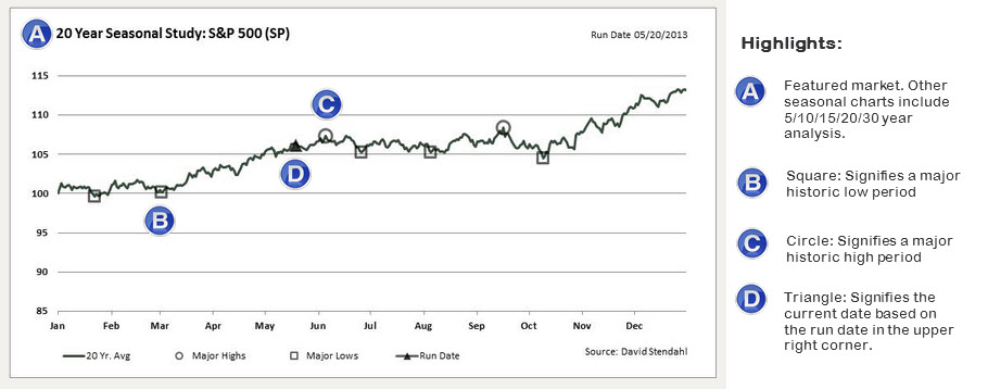
Section One: The traditional seasonal charts focus on all of the major turning points for the featured market. The triangle shows the current date as it provides the location on the seasonal chart. The seasonal chart below centers on a 20 year average, but in total we provide seasonal chart that span 5/10/15/20/30 yearly averages. Each chart has its own seasonal turning points so it’s a good idea to review all time periods. Markets that show turning points on a few seasonal charts may warrant closer attention and further analysis.
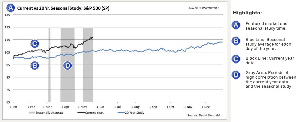
Section Two: The next set of charts review if the featured market is accurately tracking any of its seasonal charts. The gray vertical boxes clearly outlines if the current market is closely following any of the 5/10/15/20 seasonal charts. Given that we track four time frames the best rating will be 4 out of 4 … meaning that the 5/10/15/20 charts are all accurately tracking their seasonal charts. Here is a link to a listing of current markets that are tracking multiple seasonal charts [Seasonally Accurate Markets].
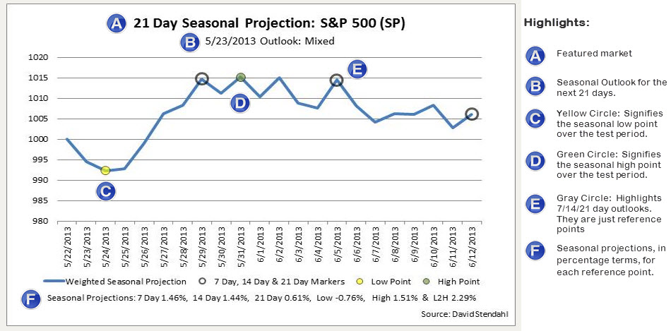
Section Three: The final set of charts focus on seasonal projections for the featured market. The seasonal projection is a weighting of four historic seasonal averages for S&P 500 Index. Specifically, we combine the 5/10/15/20 yearly averages to form a single seasonal line. This seasonal weighted line (shown in blue) is then projected forward 21 calendar days from the outlook run date. Grey circles provide perspective for potential 7/14/21 day return projections. Low and high points over the 21-day period are highlighted in yellow and green respectfully, pointing out potential returns. The final return figure listed on the chart relates the Low to High (L2H) point or High to Low (H2L) point depending upon the Low/High historic order. Each of these return figures are posted at the bottom of the chart and should be used strictly for reference purposes only.


