Market Comparison: Sugar vs S&P 500 Index
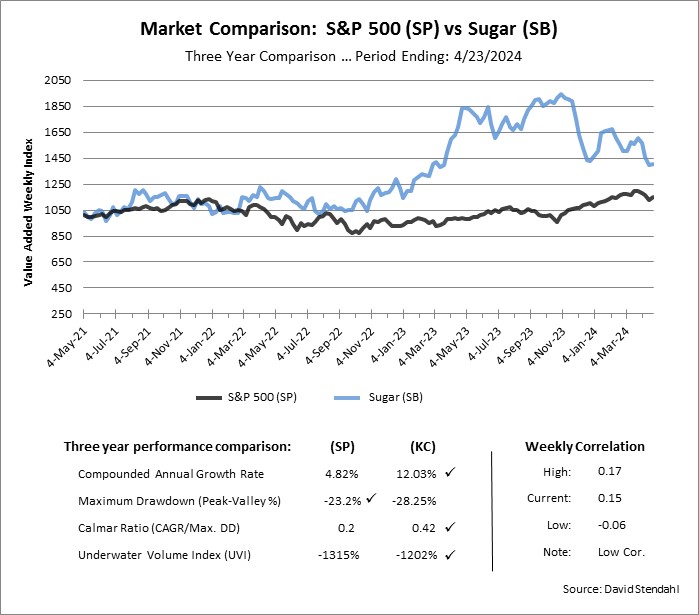
Risk and Reward is the name of the game for any market. The chart below compares the S&P 500 Index against Sugar over the course of three years. The comparison has been normalized using the Value Added Weekly Index (VAWI) method. The VAWI line assumes an initial $1,000 is invested in each market. Over time, weekly percent returns are added and subtracted to show individual performance equity curve for the markets. It should be noted that in the futures markets, we can’t invest exact amounts because we cannot trade fractional contract, so the VAWI line provides direction but not actual price levels for the market. The VAWI method does however provide an advantage as it normalizes performance which allows us to evaluate futures markets on the same scale.
Market comparison metrics:
- Reward: Compounded Annual Growth Rate (CAGR).
- Risk: Maximum Peak-to-Valley Drawdown.
- Reward/Risk Ratio: Calmar is a 36 Month CAGR / Max Drawdown ratio.
- Total Risk: Underwater Volume Index (UVI) summarizes all Drawdown periods.
- Market Correlation: High, Low & Current correlation values.
Three Year Market Comparison:

Check marks indicate the best performance over the three year test period.
