50/150/200 Day Moving Average Cross Comparison
Moving averages provide “perspective’ to the general direction of a market. Yes … they are slow but they can keep you grounded and focused on the correct side of a bull or bear phase. The main chart, Multiple SMA, summarizes the phase for three separate simple moving averages for a variety of futures markets. Markets that are above their 50, 150 and 200 day moving averages appear in tan (pointed right) while those that are below all three moving averages appear in grey (pointed left). Market with mixed moving averages appear in black with a biased to the bull side (right) or bear side (left). The other three charts breakdown the specific phase for each of the 50/150/200 day moving averages.
50/150/200 Day Moving Average Market Cross Comparison:
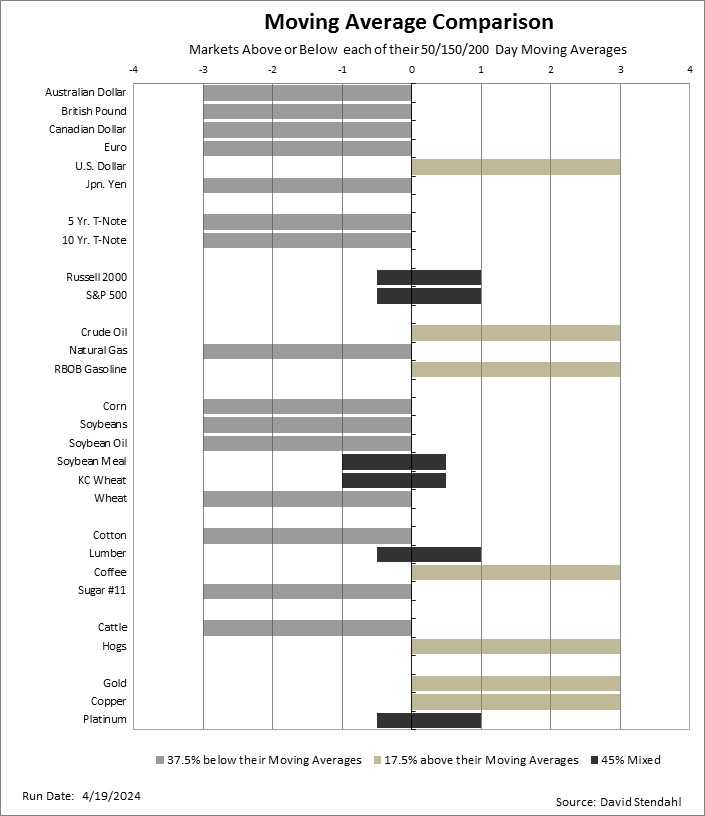

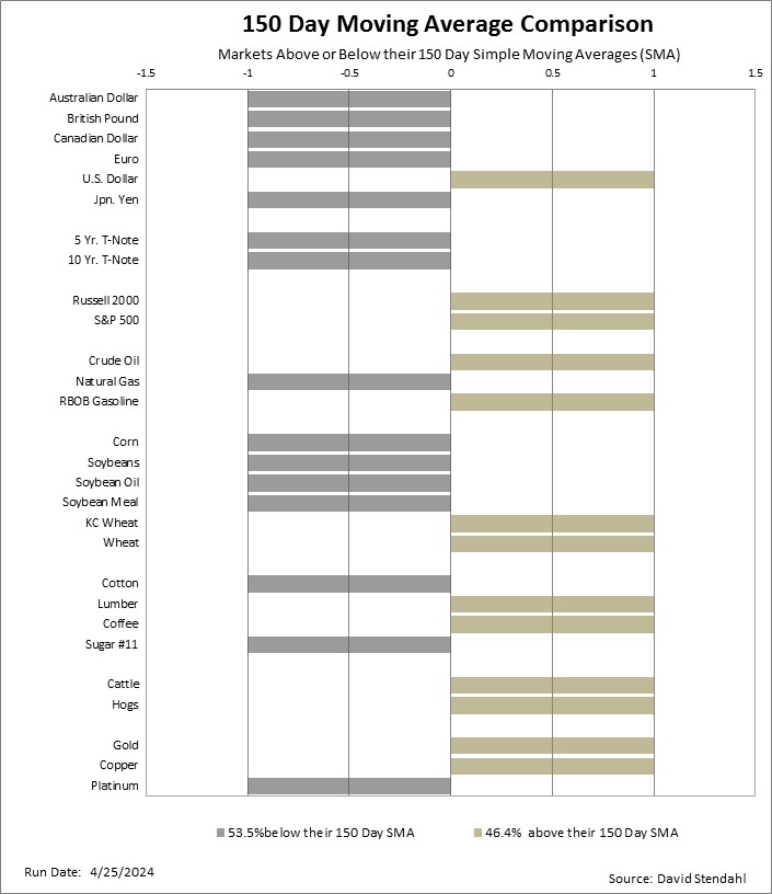
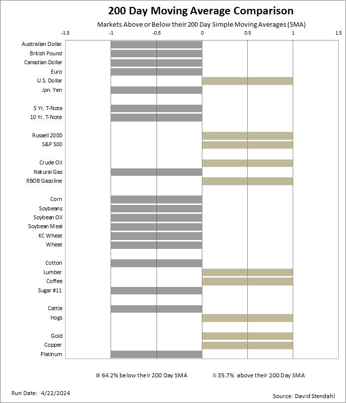
Note: the scale of the chart has no meaning … the bar direction (right or left) provides the only reference. This simple moving average (SMA) comparison is not to be used for buy or sell signals but rather as a general overview of current directional phase.