Correlation Introduction
We offer weekly & monthly correlation studies for 40 global futures markets. Our correlation studies are a little different from some others for two main reasons. First, we use percent return data rather than price data, as it normalizes that correlation study making comparisons all the easier. Second and perhaps more importantly, our high/low correlation definitions dynamically change over time to reflect different market phases. Our rolling correlation studies provide a visual perspective on the ever changing relationship between markets. In total we provided 3,200 correlation charts, each of which is updated twice per week. The two links below will direct you to a list of 40 futures markets … one based on weekly data and the other monthly data.
Review Guide
Each market correlation page is broken down into three sections; stability, high/low breakdown & dynamic correlation charts. Let’s take a closer look at what these three sections provide.
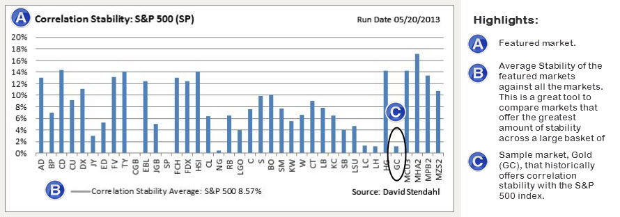
Section One: Correlation Stability
The first section provides a quick reference of markets that offer stable correlations over time. In this case, stable does not refer to correlations that are high or low … it simple means correlations that typically remains steady over time. The correlation stability chart provides a side-by-side comparison of 39 markets against the featured market. The higher the stability percentage the more volatile the correlations have been over the test period. With all thing equal begin by focusing on market relationships that offer low (i.e. less volatile) correlation stability numbers over time.
Example: The perfect scenario to look for is a near zero correlation between markets that is also stable over time. Take for example. the S&P 500 (SP) index and Gold (GC) which historically offer a near zero correlation. Based on the Correlation Stability chart below the S&P 500 index and Gold has a low correlation stability number in comparison with a lot of other markets. So if your looking to add a new market in to your equity based portfolio … Gold might be a good market to offer up a little added diversification.
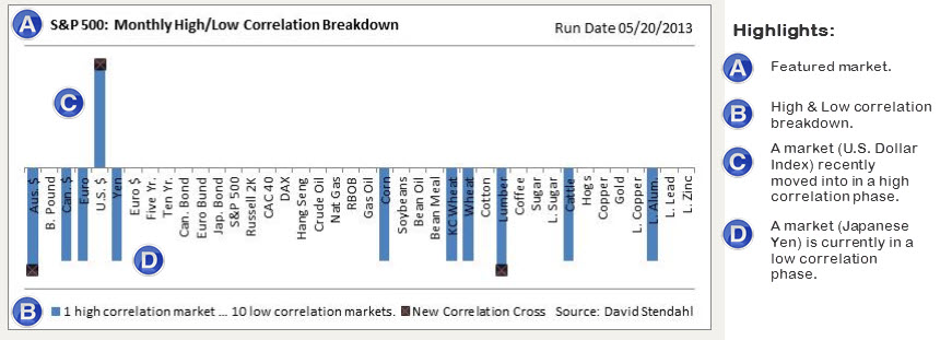
Section Two: High / Low Correlation Breakdown
With a long list of market to scroll through this section offers a quick visual of markets that are currently in a high or low correlation stage with the featured market. Note markets that recently moved into a high or low correlation stage are highlighted at the end of the bar with an “x”.
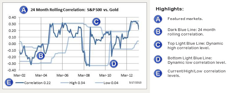
Section Three: Dynamic Correlation Charts
It’s all about the charts … and we have a lot of them. Our correlation charts provide a historic rolling perspective on the relationship between two markets. The 24 month rolling correlation below, represented as the dark blue line, clearly shows a continually changing relationship between the markets. Sometimes the relationship is strong while at other times it’s weak. The point is … markets move as such so do their correlations. Thus we need to continually adjust our interpretation as to what is considered to be a high or low correlation level. To assist in this dynamic interpretation, each chart is banded with light blue lines (top & bottom) to reflect true correlation levels. Current levels are also posted at the bottom of the chart.