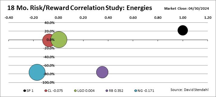
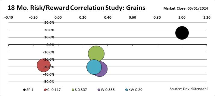
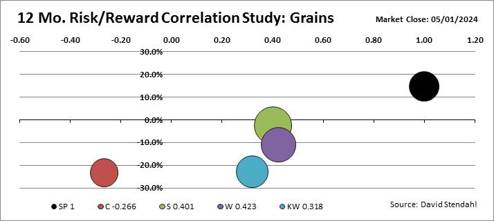
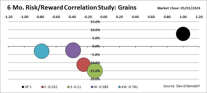
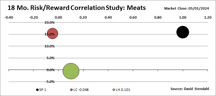
Risk/Reward Bubble Charts: 6/12/18 Month Analysis
How volatile is your market?
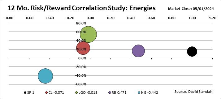
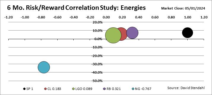
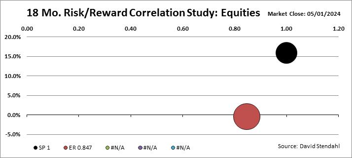
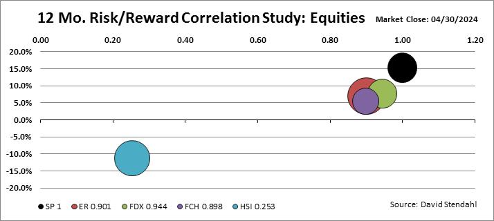
The Risk Reward profiles below are split into eight separate sectors each of which is compared against the S&P 500 Index. The graphic is a simple risk reward scatter chart with a twist that includes market correlation against the S&P 500 Index. Risk (bubble size) is defined as monthly return deviation or volatility … the larger the bubble the greater the risk. Reward (vertical axis) is defined as Compounded Annual Growth Rate or CAGR … the higher the return the greater the reward. Correlation (horizontal axis) is defined as the correlation for each market against the S&P 500 index over the various time periods.
Each sector risk reward profile consists of three bubble charts covering 6/12/18 month snap shots. To view all of the profiles simple click on the right/left arrows to scroll through the various time frames or just let them slowly animate.
Bubble Chart Overview:
- Vertical X-axis = Percent Return
- Horizontal Y-axis = Market Correlation vs the S&P 500
- Bubble Size Z-axis = Daily Standard Deviation of Return (Volatility)
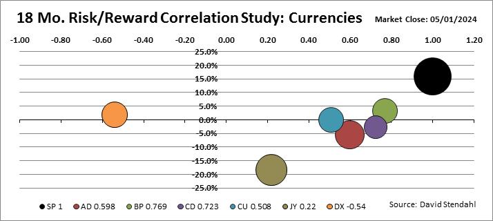
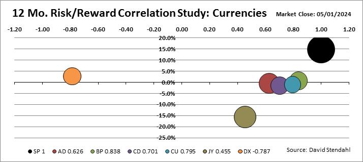
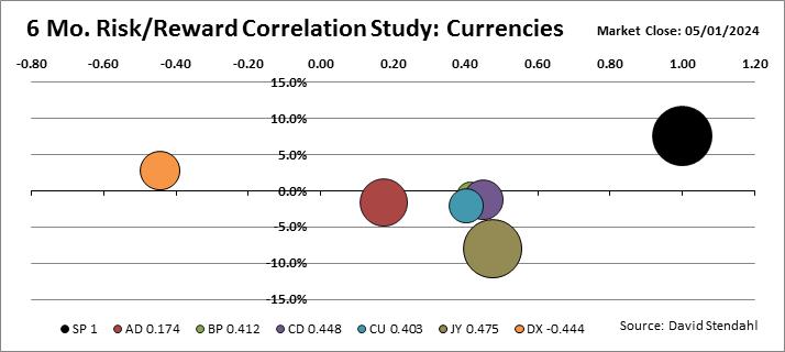
AD: Australian Dollar
BP: British Pound
CD: Canadian Dollar
CU: Euro
DX: U.S. Dollar
JY: Japanese Yen
SP: S&P 500 Index
CL: Crude Oil
LGO: London Gas Oil
RB: RBOB Gasoline
NG: Natural Gas
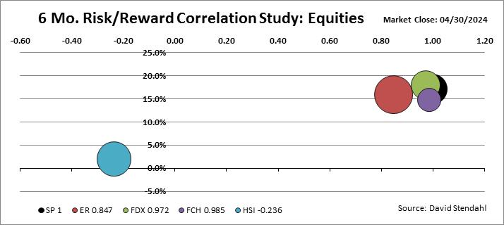
SP: S&P 500 Index
TF: Russell 2000
FDX: German DAX
FCH: Paris CAC-40
HSI: Hang Seng
SP: S&P 500 Index
C: Corn
S: Soybeans
W: Wheat
KW: Kansas City Wheat
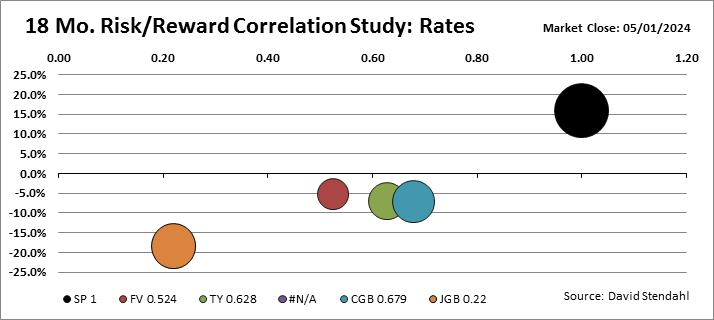
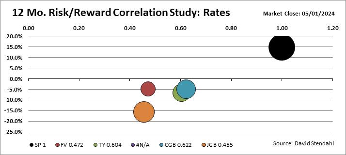
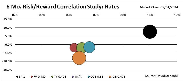
FV: Five Year Notes
TY: Ten Year Notes
EBL: Euro Bund
CGB: Canadian Govt Bonds
JGB: Japanese Govt Bond
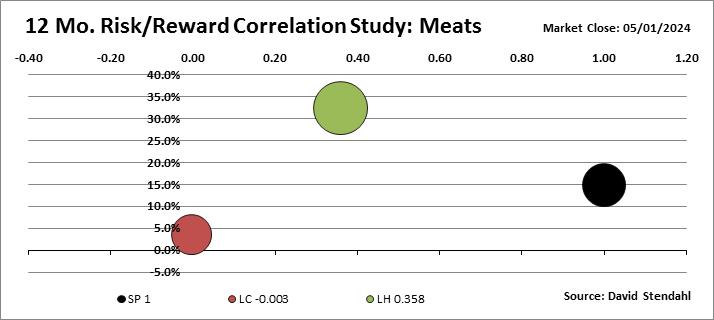
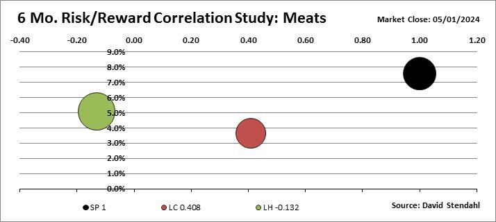
SP: S&P 500 Index
LC: Live Cattle
LH: Lean Hogs
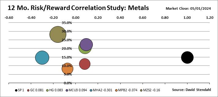
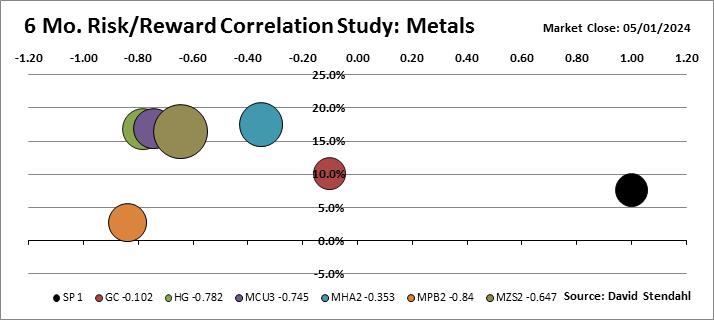
GC: Gold
HG: Copper
MCU: LME Copper
MHA: LME Aluminum
MPB: LME Lead
MZS: LME Zinc
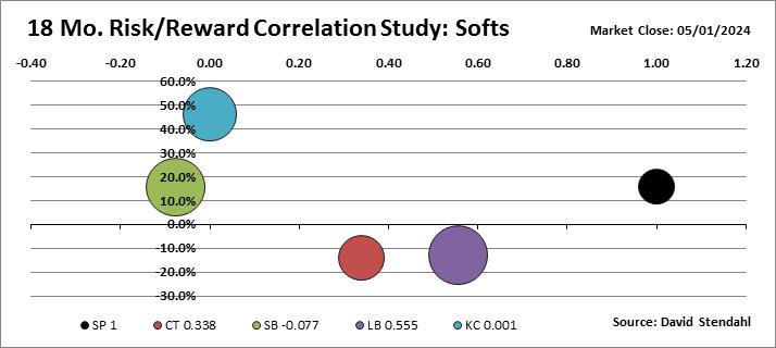
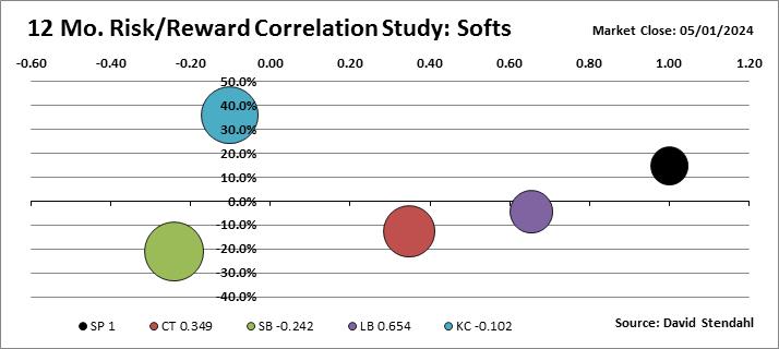
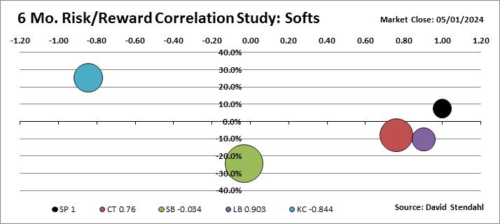
CT: Cotton
SB: Sugar
LB: Lumber
KC: Coffee