Diversification by the numbers …
This study compares the performance metrics of three portfolios over the last 30 trading days, in an effort to highlight the great importance diversification adds to any trading portfolio. All too often traders focus exclusively on the S&P 500, seemingly to forget that there are plenty of other markets that could be traded along side the popular stock index. The object, therefore, of this study is to drive home the advantages of diversification as well as introduce traders to markets that might not otherwise be traded.
Trading Portfolios:
- The first portfolio is passively managed based on a buy and hold stock portfolio. We will use the S&P 500 Index as our proxy for stocks. The Passive Portfolio (shown in blue) will excel when the S&P 500 Index is in a strong bull phase. There will be nothing to hold it back as it takes full advantage of any market surge. As a buy & hold portfolio it should however under-perform actively managed portfolios during sideways markets and suffer during a bear market phases, as it has no diversification protection.
- The second portfolio is actively managed based on trade adjustments continually made to 36 markets across eight separate sectors. The Active Portfolio (shown in green) should fair well under a wide variety of trading phases; bullish, sideways and bearish. The actively managed portfolio offers two distinct advantages over the passive portfolio. First is its ability to trade long or short in any market. The second advantage is its sheer level of diversification across a wide variety of markets.
- The third portfolio is a combination between the passive and active portfolios based on a 60/40 split. The Combination Portfolio (shown in orange) should offer the most stable results based on risk and reward measures. This portfolio simple combines the Passive and Active portfolios together to create one that is heavily biased towards equities but with added advantage of full market diversification.
In the sections below we will outline the markets and allocations used in the construct of our portfolios along with providing risk/reward metrics to compare each of our Passive/Active/Combination portfolios. Note: All Portfolio numbers will be updated on a daily bases … so stop back regularly to see the portfolio adjust to ever changing market conditions.
Markets, Directions and Allocations
- Passive Portfolio only trades the S&P 500 Index (blue bar) from the Long side.
- Active Portfolio trades all the markets (green bars), except the S&P 500 index, from the Long or Short side each with varying degrees of allocation which are updated daily.
- Combination Portfolio uses the same markets but with adjusted allocations.
Chart 1: Market Breakdown; Long Short or Flat
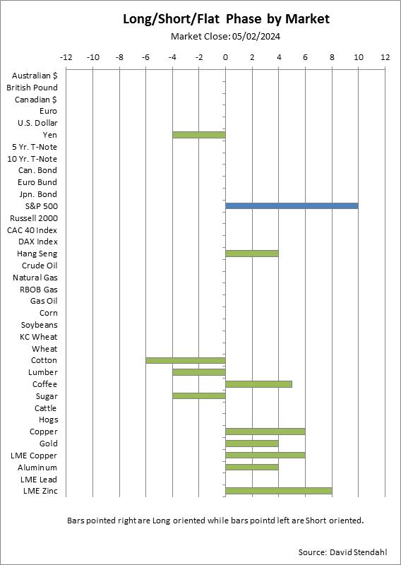
Note: Bars that point to the right represent Long oriented positions while those pointed to the left are Short oriented. Markets that are flat or on the sidelines are blank. The size of the bars represent a level of allocation that will be used in the construction of the portfolios. For the sake of simplicity the larger the bar … the higher its eventual allocation within the portfolio.
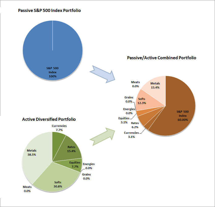
Portfolio Allocations
The chart below shows the current allocation breakdown for each of the three portfolios. The Passive S&P 500 Index portfolio will remain constant as it’s “buy and hold strategy” is always 100% invested in stocks. The Active portfolio, on the other hand, constantly changes in an attempt to take full advantage of Long and Short positions across all markets. The combined portfolio will always have a heavy allocation in the S&P 500 Index but will also change day-to-day based on adjustments to the Active portfolio.
Chart 2: Portfolio Allocation Breakdown
Portfolio Comparison
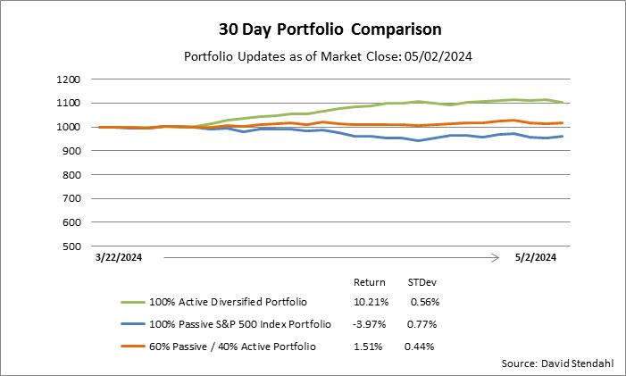
This section provides an equity curve break down for each of the three portfolios over a short-term 30 day period. Pay close attention to the performance numbers at the bottom of the chart. Under normal trading conditions we would like to see an increase in return numbers and a decrease in risk numbers between the active/combined portfolios versus the general passive portfolio. A full performance breakdown for the portfolio is covered in the next section.
Chart 3: Thirty day equity curve comparison
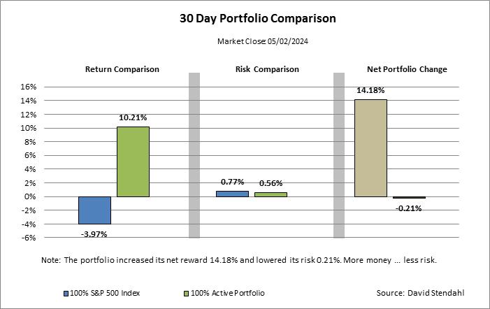
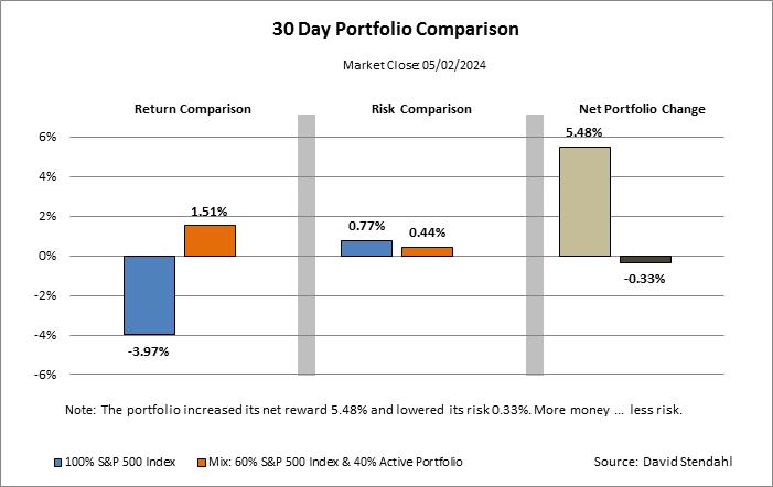
Performance Comparison
Show me the numbers …
This section compares risk/reward metrics between the sets of portfolios:
- Passive (blue) vs Active (green)
- Passive (blue) vs Combination (orange)
The charts below provide a basic analysis, as they identify the differences between the two portfolios. The charts are divided into three sections: return comparison, risk comparison and portfolio change. The first section shows the percent return figures for the portfolios over the thirty days. The second section focuses on risk, which is defined as standard deviation of return, over the same time period. The final section shows the net percentage change to the portfolio’s performance with return highlighted in light brown and risk in dark brown.
Charts 4 & 5: Performance Breakdown